Even on the dullest winter day, colour fills our lives. Look around and you’ll see a thousand shades of greens and browns, violets, greys, golds and blues. Colour is also part of our language. Few of us will dispute that it affects our moods and how we feel — red with anger, green with envy, yellow with fear.
For these reasons, colour is also the decorator’s most powerful tool. No other design element has the quick impact or dramatic effect of colour. If you want to add appeal and value to your home, there is no faster and often cheaper way than by using colour.
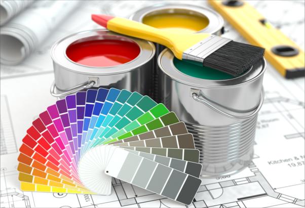
Whether it’s a quick, relatively inexpensive pick-me-up paint job, new window coverings, complimentary wallpaper borders, new carpets, floors or other interior/exterior home improvements, colour can transform any room, cupboard or furniture item.
Before getting started, consider what you want to achieve. Do you want to make a room or window look larger or smaller, a ceiling higher or lower? Do you want the atmosphere to be lively or restful? Businesses, especially restaurants, often use colours such as bright, warm orange to enhance appetites. Manufacturers often use red to draw attention to packaging. Hospitals use restful colours like blue green to soothe people.
Selecting colours
Just as colours in clothing move in and out of fashion, so do colours in interior decoration. The past decade saw a swing back to bright, dark colours, including very popular greens and reds that reminded us of rich spices. It’s anyone’s guess what the next trend will be, but the neutral classics will always remain.
Choosing colour combinations for your home isn’t that easy. It requires commitment. Whatever you do, you may have to live with it for a while. Also, if you have plans to sell your home, you want to consider colours that will also appeal to prospective buyers. When people view a home, they like to imagine how their own belongings will look in it. Purple walls or furnishings in your home may make it difficult.
Colours also look different in combination with other colours and in different types of lighting. A red may appear cold under a fluorescent light, but much warmer in a room with lots of natural light. A deep blue may look bright and intense in a well-lit area, but cold and gloomy in a dark room. Beige may seem dull and boring, but add a little yellow, green or orange and it comes alive.
The amount of colour also affects how you see it. An all-red interior is too stimulating for most homes. Red is best used as an accent to add drama and intrigue. But beware of high-contrast situations. Used in large areas of white or green, for example, red can also be trying to the eyes.
Colours affect our emotions and perceptions. Red has been known to send the heart-rate up. Orange and peach are associated with comfort and security. Purple, through its association with religion, is often associated with mourning. Research suggests that blue not only has a calming affect on people, but may actually lower blood pressure. It is associated with purity and cleanliness and is at the top of the popularity chart for most adults. Green is considered the most peaceful colour.
Some decorating tricks
- Warm colours like reds, pinks, yellows and oranges will generally make a room feel warmer, smaller and friendlier.
- Cool colours like greens and blues create a cooling, calming affect. They seem to push back the walls of a room and make small spaces appear bigger.
- Light, cool colours can make a small room look larger and brighter.
- Dark, warm colours can turn a large, cold room into something more inviting.
- Neutral shades make a room more flexible for any type of furniture.
- Raise a ceiling by painting it a lighter colour than the walls; lower it by painting it a darker colour, or by adding a darker border where the wall meets the ceiling.
- Shorten a long hallway by painting the end walls a darker, warmer colour.
- Use colour on furnishings to add brightness and drama. Pastel furnishings look smaller in a room, while deep, bright furnishings look bigger.
- Camouflage eyesores, such as old radiators, by painting them the same colour as the walls.
- Try to have a natural, complimentary flow of colour from one room to another.
Source: Ontario Real Estate Association